Autumn
Empowering Your Best Life in Retirement
Background
Autumn is a digital platform created to help people successfully plan, manage and enjoy their retirement.
Incubated by SC Ventures (a subsidiary of Standard Chartered), the platform integrates health, wealth and lifestyle data. This holistic view provides users with the tools they need to make informed decisions and build a fulfilling future.
Challenge
The retirement planning landscape is typically fragmented, overly complex and often addressed too late in an individual’s life. Consumers face a confusing array of disconnected financial products, a lack of actionable health insights and a shortage of clear, impartial guidance. The core challenge was to develop a brand for Autumn that communicated clarity, trust and optimism, while positioning the platform as both a practical solution and an inspiring partner for life’s next chapter.
Solution
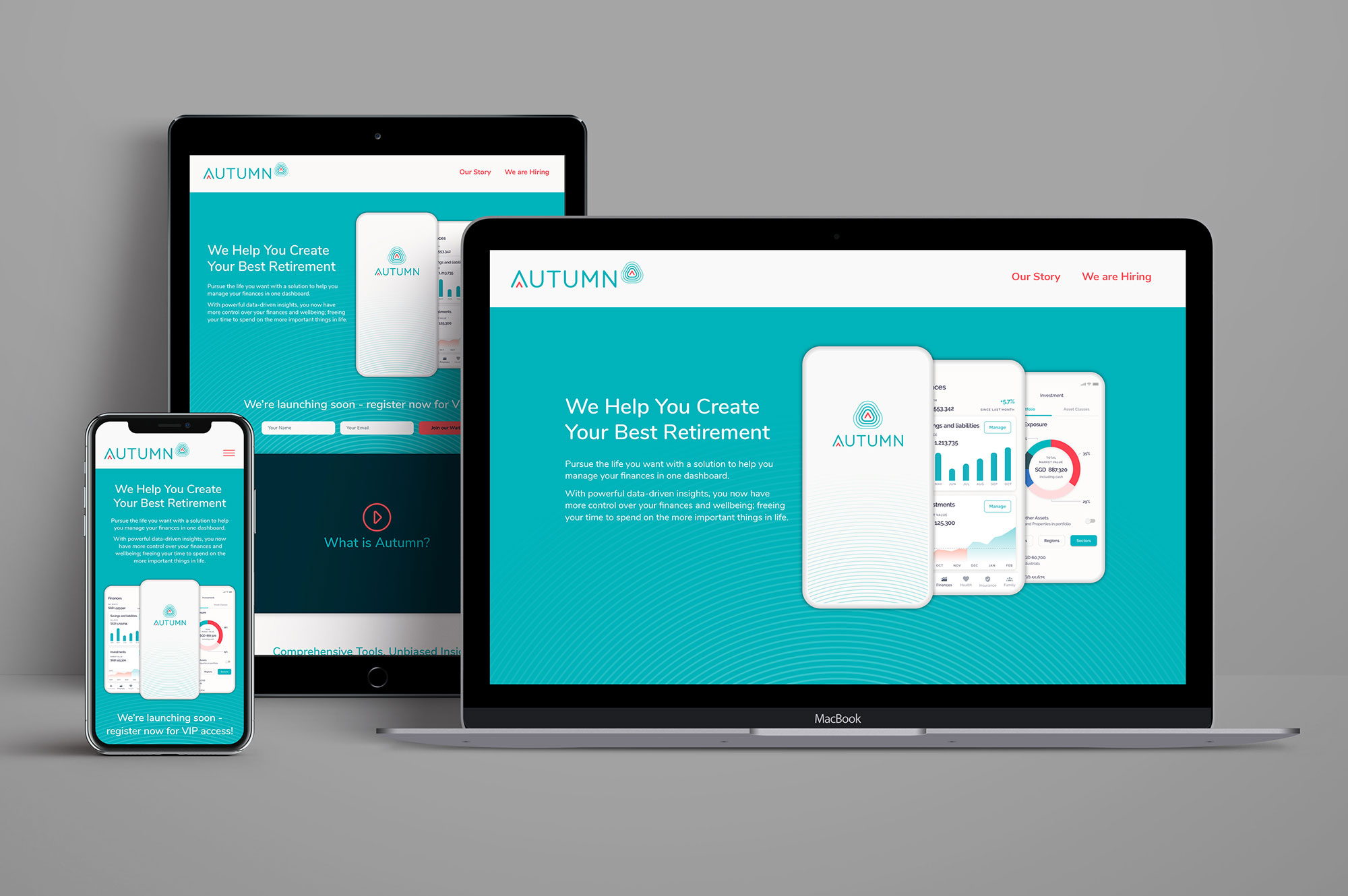
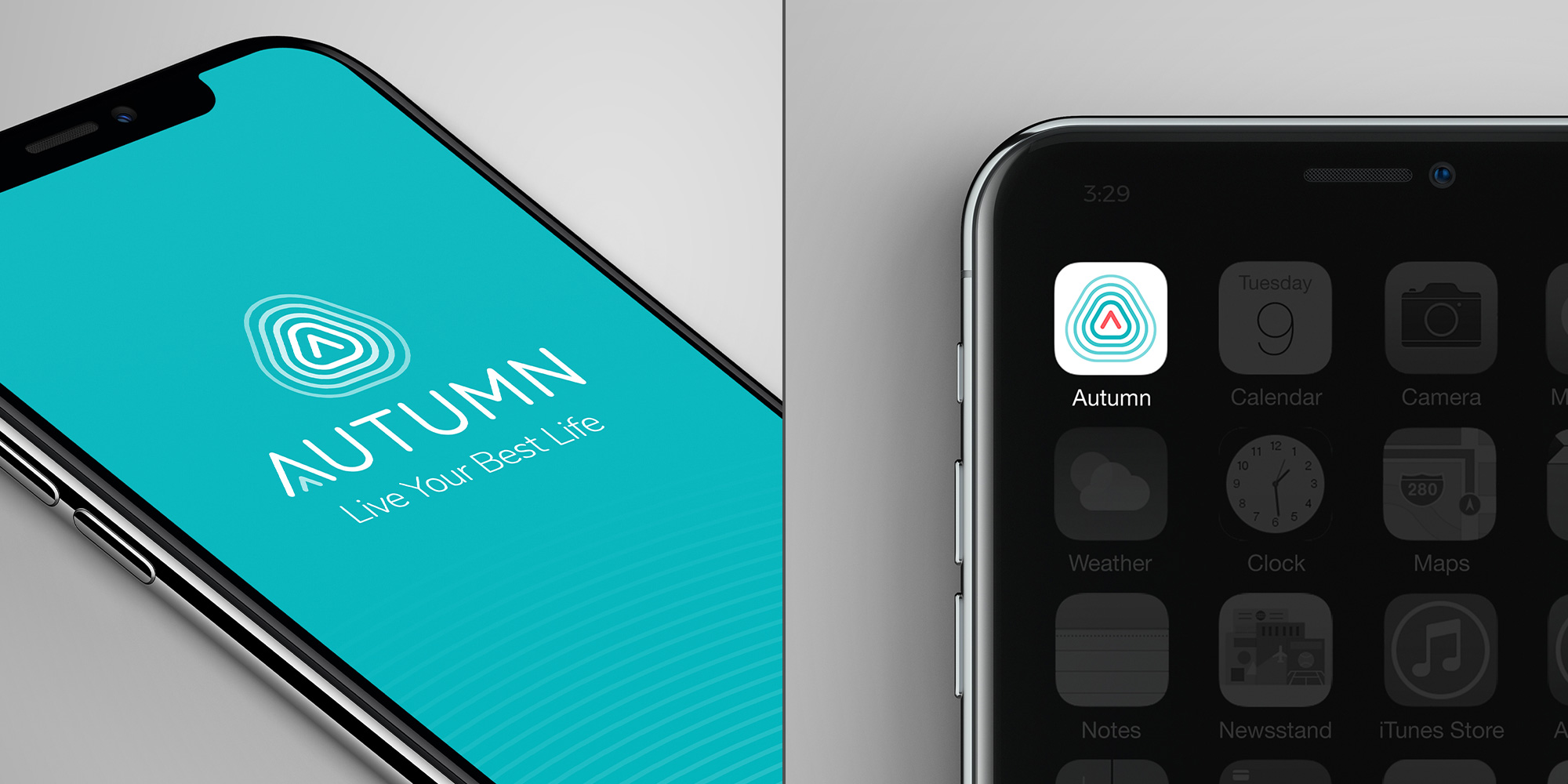
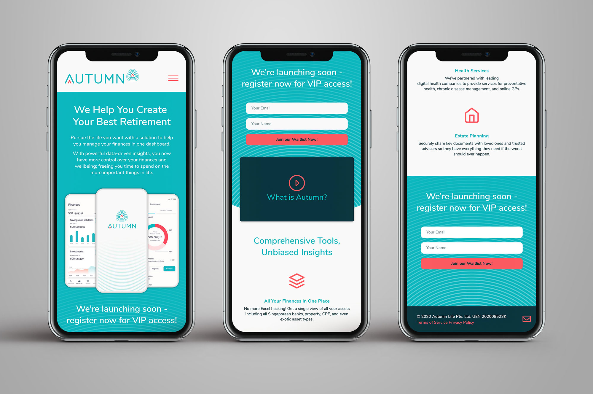
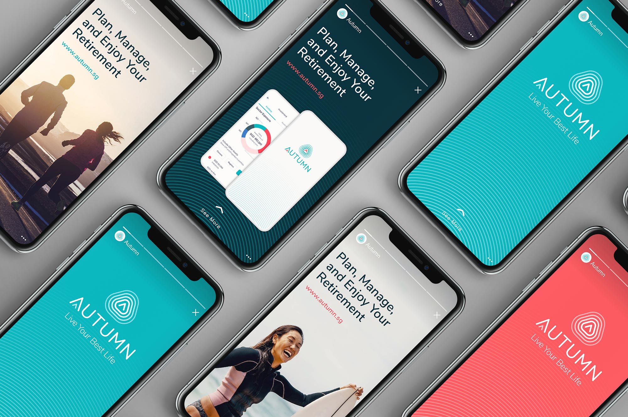
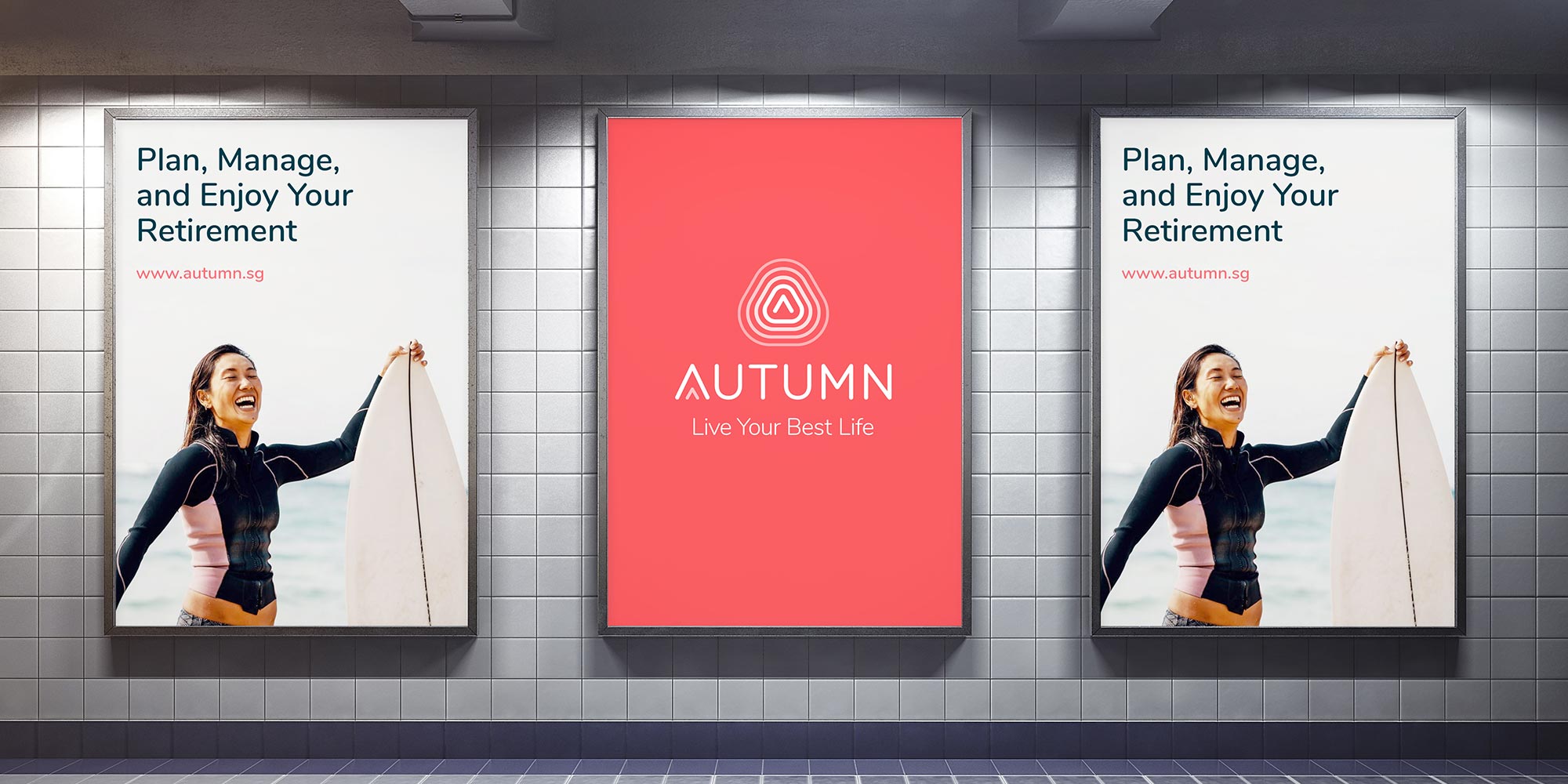
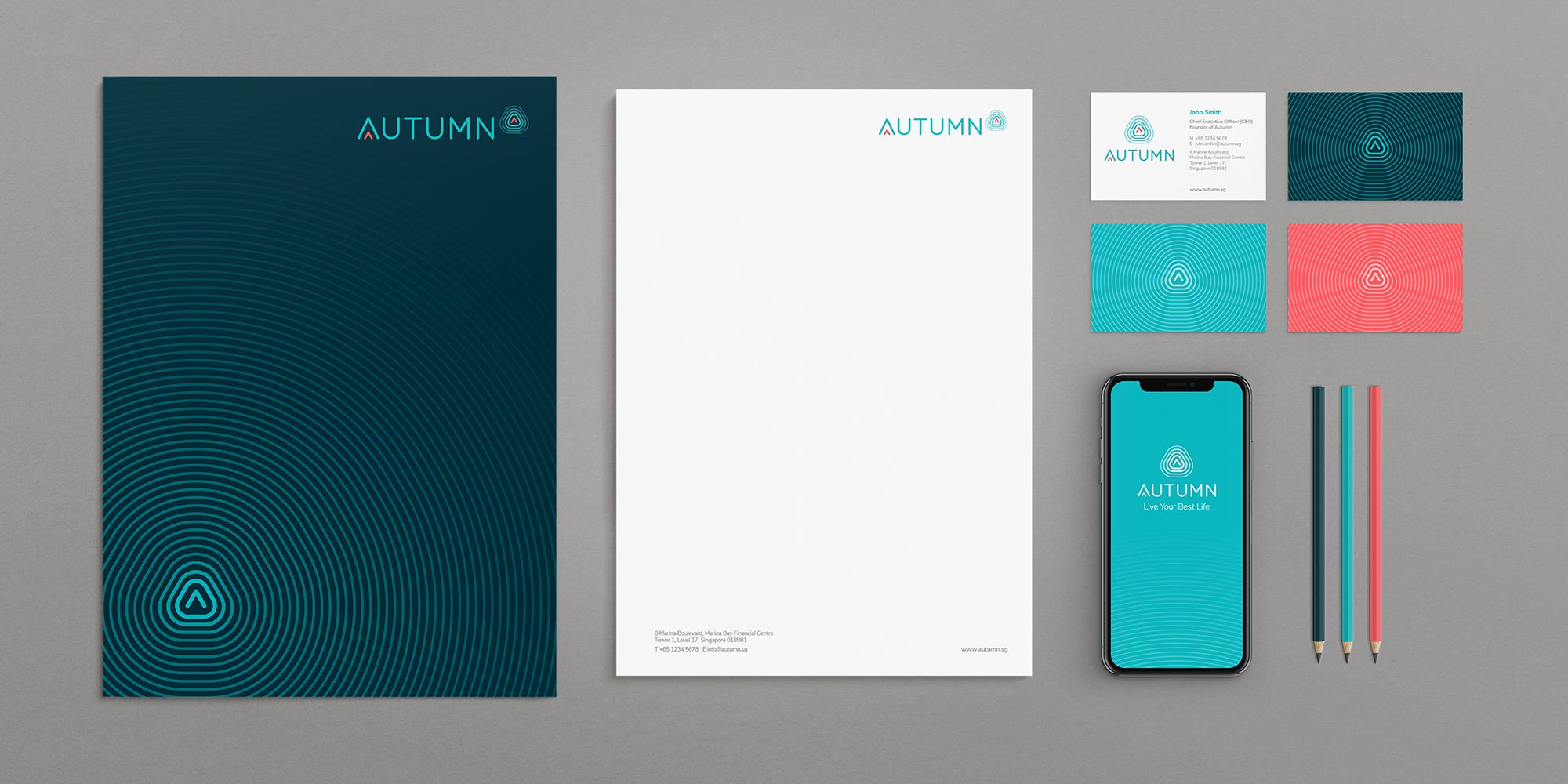
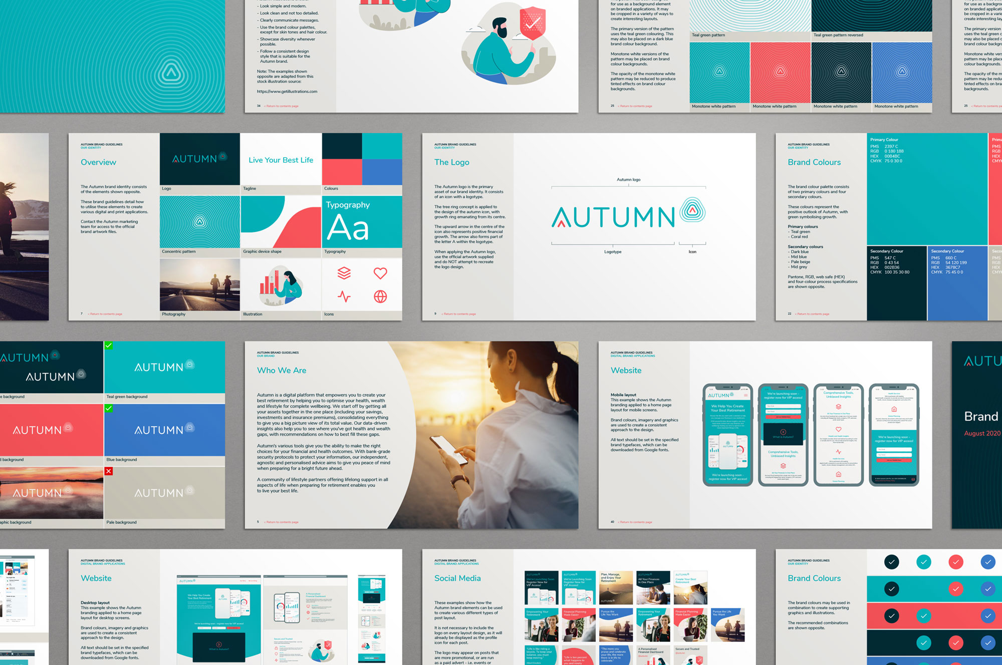
We developed a comprehensive brand strategy and visual identity to embody Autumn’s principles of empowerment, security and ethical guidance. The logo design was inspired by the concentric rings found within a tree trunk, symbolising growth. The visual system is built on a vibrant colour palette of turquoise, coral red and deep navy, conveying freshness, energy and trust. This identity was applied across all brand touchpoints, including digital platforms, mobile apps, billboards and social media. Comprehensive brand guidelines were produced to ensure a consistent, engaging presence that connects emotionally with audiences and builds long-term brand equity.