

From Shelf to Sensation: How Halo Top’s Packaging Makeover Changed the Ice-Cream Landscape
30 June, 2026
In the fiercely competitive world of consumer goods, the success of a new product often hinges on the first impression it makes on the shelves. For brands, especially those just starting out or lacking widespread recognition, the packaging can make or break their entry into the market.
Halo Top has emerged as one of the biggest consumer phenomenons in recent years, with a devoted consumer base that snaps up as much of its low-calorie, high-protein ice cream as stores can stock. The brand made its debut in 2012, but it wasn’t until 2015 that sales really took off, thanks to a pack redesign that has since sparked a raft of imitators. Until recently, they did almost no advertising, and the team continues to forgo a traditional office, instead working remotely and out of a shared co-working space.
When Halo Top first entered the market, their packaging followed a conventional approach – placing the brand name prominently in the centre, with the product’s benefits listed underneath. While this might seem like a sound strategy, it quickly became apparent that it wasn’t resonating with consumers.
Consumers shopping for ice cream weren’t looking for a specific brand; they were looking for a product that met their needs – whether that was lower calories, higher protein, or something else entirely. Halo Top’s initial packaging failed to communicate these benefits in a way that grabbed attention or conveyed the value proposition quickly.
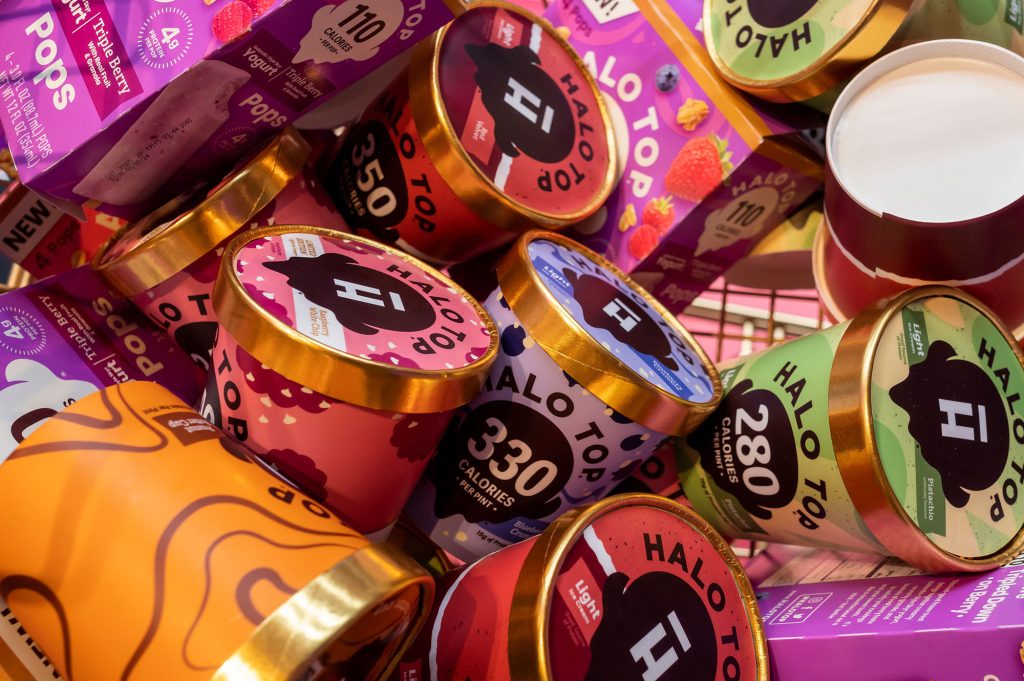
The transformative shift came with a strategic redesign focused on flipping the script. Instead of emphasizing the brand name, the new packaging made the product’s most important attribute – the low-calorie count – the star of the show. The calorie count was displayed prominently and boldly on the front of the packaging, making it the hero of the design. This was an instant differentiator in the ice cream aisle, where consumers were accustomed to seeing calorie counts hidden away on the back of the packaging, if at all.
Another key change in the redesign was the way they communicated the product’s protein content. In the original design, “7g of protein” was listed on the packaging, but this information was somewhat buried and presented in a way that didn’t immediately communicate value. Consumers might see “7g” and wonder if that’s a lot or a little, or why it even matters in the context of ice cream.
In the redesign, Halo Top scrapped the numerical focus and instead used the phrase “good source of protein.” This change was subtle but significant. It immediately told consumers why they should care, without requiring them to do any mental calculations. It was also unexpected in the context of ice cream, further reinforcing Halo Top’s unique position in the market.
For new brands, the Halo Top story is a powerful reminder that when your brand is unknown, your packaging needs to work harder. It’s not enough to create something visually appealing; your packaging needs to communicate your product’s benefits quickly and clearly. In a crowded market, consumers aren’t looking for a brand they’ve never heard of – they’re looking for a solution to their needs.
The brilliance of Halo Top’s packaging lay in its alignment with zeitgeist values: Transparency, health awareness, and immediacy of information. Consumers today shop less by brand loyalty and more by tangible product benefits, especially in categories linked to wellness. Halo Top’s transformation was validated when it was sold in 2019 for an undisclosed sum (rumoured to be close to US$2 billion). It was part of another deal when its parent company was acquired by candymaker Ferrero in 2022. Not bad for a humble tub of ice cream.
It just goes to show that in the right hands, packaging is not just a container but a powerful brand ambassador and business driver.

From identity to Infrastructure: A New Era for Brands
Cannes Lions 2026 signalled a shift from brand expression to execution. The future of strategic brand design lies in creating useful systems, services and experiences that make a brand’s promises tangible.
Brands Must Earn Their Place in Your Day – or Die
We explore how Uniqlo’s John C Jay built an influential creative career by connecting brands with art, culture and everyday life, revealing why curiosity, humility and cultural participation are essential to creating brands that genuinely matter.

Culture’s New Rules: Six Edges Quietly Crushing or Catapulting Thai Brands
Discover six cultural shifts reshaping Thai brands in 2026, from changing attitudes towards authenticity and technology to emerging consumer behaviours, and learn how marketers can turn these new cultural forces into meaningful, lasting competitive advantage.
From Shelf to Sensation: How Halo Top’s Packaging Makeover Changed the Ice-Cream Landscape
Bold, original creativity remains essential for business success, yet creative confidence is declining due to weak insights and limited cultural agility. The 2025 State of Creativity report by Cannes LIONS Advisory highlights a landscape filled with both opportunity and challenge.

From Fish Fingers to Blue Chips: How Ian Glover Quietly Shapes Asia’s Brands
From London packaging studios to Bangkok boardrooms, Ian Glover’s design journey spans almost 20 years across Asia. In this profile, the Brand New Day Asia Design Director discusses creativity, technology, branding and the importance of balancing curiosity, precision and commercial thinking.

The Handbag Whisperer: Emily Cheetham Designs Confidence You Can Carry
Discover Emily Cheetham handbags and the story behind Elyse & i, an independent accessories brand defined by thoughtful design, everyday function and a quietly distinctive approach to brand identity.

Beautiful but Broken: The Hidden Cost of Designing on Top of Fuzzy Policy and Fuzzier Brand Narratives
Design works best as an amplifier, not a fixer. When the brand story is unclear, even the best design struggles to create real impact.

Beyond the Algorithm: Building Brand Moats from Emotional Design
In an AI-saturated marketplace, emotional design has become one of the last true brand moats. Pattern-matching can give you polish but only empathy gives you presence. The brands that win will be the ones that make people feel something memorable and unmistakably human.

Where Memory Meets Design: The Secret Alchemy Behind Forbidden Hill’s Treasures
Jewelry is memory made wearable, a tapestry of moments, emotions and identity carried close to the skin. Few brands embody this idea as naturally as Forbidden Hill, a contemporary lifestyle label shaped by the stories, spirit and cultural richness of Southeast Asia.

Creative Confidence: An Endangered State of Mind?
Bold, original creativity remains essential for business success, yet creative confidence is declining due to weak insights and limited cultural agility. The 2025 State of Creativity report by Cannes LIONS Advisory highlights a landscape filled with both opportunity and challenge.